Wireframe
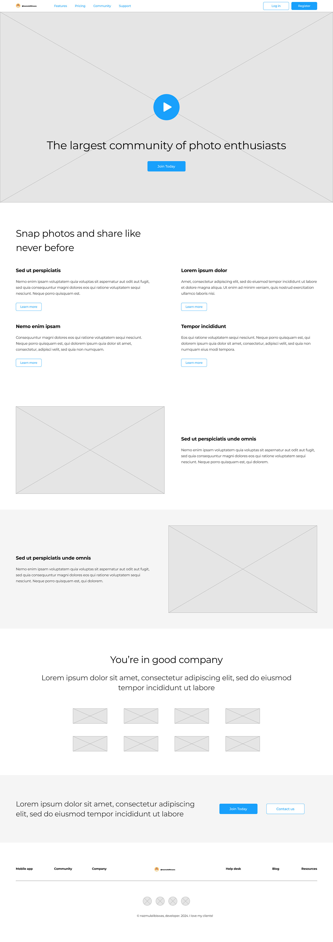
In UX design, a wireframe is a visual blueprint that shows how a product will work. It's a two-dimensional outline of a webpage or app that shows the page structure, layout, information architecture, user flow, functionality, and intended behaviors. Wireframes are usually the first iteration of a product and are used as the basis for the rest of the product's design.
What is wireframe?
A wireframe is a visual representation of the layout of a webpages or application. It's a skeletal outline that outlines the placement and arrangement of elements such as buttons, text, images, and other UI components. Wireframes are typically created early in the design process to establish the basic structure and flow of the user interface (UI) and user experience (UX) without getting into detailed design elements like colors, fonts, or graphics. They serve as a blueprint for designers and developers to understand the layout and functionality of the final product and to gather feedback from stakeholders before moving on to more detailed design stages.
Is that easy to make UI/UX?
Creating a good UI/UX design can be both challenging and rewarding. While the basic principles of good design are relatively straightforward, implementing them effectively requires a combination of creativity, technical skill, and understanding of user behavior.
Here are a few factors that contribute to the complexity of UI/UX design:
User-Centered Design: Effective UI/UX design requires a deep understanding of the target audience, their needs, preferences, and behaviors. Designers need to conduct research, gather user feedback, and iterate on their designs to create experiences that resonate with users.
Complexity of Technology: UI/UX design often involves working with various technologies, platforms, and devices. Designers need to consider factors such as responsiveness, cross-browser compatibility, and accessibility to ensure a seamless user experience across different devices and environments.
Iterative Process: Designing a great user experience is rarely a linear process. It involves multiple iterations of prototyping, testing, and refining designs based on user feedback. This iterative approach requires patience, flexibility, and a willingness to adapt to changing requirements and insights.
Visual and Interaction Design: Designing an intuitive and visually appealing interface involves careful consideration of factors such as typography, color theory, layout, and interaction design. Designers need to balance aesthetic considerations with usability and functionality to create interfaces that are both beautiful and easy to use.
Collaboration and Communication: UI/UX design often involves collaboration with stakeholders such as clients, developers, marketers, and product managers. Effective communication and collaboration skills are essential for translating user needs and business requirements into cohesive design solutions.
While UI/UX design can be complex, it's also an incredibly rewarding field that offers opportunities for creativity, innovation, and making a meaningful impact on users' lives. With the right skills, mindset, and tools, designers can create experiences that delight users and drive business success.

Navigation
Navigation in UI/UX design refers to the system or mechanism that allows users to move between different screens, pages, or sections within a digital interface. It plays a crucial role in providing users with a smooth and intuitive experience, helping them find the information they need and accomplish their goals effectively.
Here are some key aspects of navigation in UI/UX design:
Navigation Patterns: There are several common navigation patterns, such as top navigation bars, sidebars, tab bars, breadcrumbs, and hamburger menus. Each pattern has its own advantages and is suitable for different types of applications and content.
Consistency: Consistent navigation helps users build mental models of how the interface works, making it easier for them to predict where they can find certain features or content. Consistency in labeling, placement, and behavior of navigation elements is essential for a cohesive user experience.
Hierarchy: Navigation should reflect the hierarchical structure of the content, with primary navigation options leading to broader sections and secondary navigation options providing access to more specific topics or features. Clear hierarchy helps users understand the relationship between different sections and navigate the interface more efficiently.
Visual Cues: Visual cues such as icons, labels, hover effects, and animations can enhance the discoverability and usability of navigation elements. Visual cues should be intuitive and consistent with users' mental models to help them understand the purpose and functionality of each navigation option.
Responsive Design: Navigation should be optimized for different screen sizes and devices to ensure a consistent experience across desktop, tablet, and mobile platforms. Techniques such as responsive navigation menus, collapsible menus, and touch-friendly controls help adapt navigation to various screen sizes and input methods.
User Feedback: Providing feedback to users when they interact with navigation elements helps reinforce their actions and informs them about the outcome. Visual feedback such as highlighting active menu items, indicating loading states, and providing confirmation messages enhances the usability of navigation.
Overall, effective navigation design is essential for creating a user-friendly interface that guides users through the content and functionality of an application, website, or digital product. By prioritizing clarity, consistency, and usability, designers can create navigation systems that enhance the overall user experience and contribute to the success of the product.

Hero Section
What is hero section?
The hero section, also known as the hero image or hero banner, is the large, prominently placed section at the top of a webpage or digital interface. It's typically the first visual element users encounter when they visit a website or app and plays a crucial role in capturing their attention, communicating the brand message, and guiding them further into the site.
Key characteristics of a hero section include:
Large and Visually Impactful: The hero section usually features a large, high-resolution image or video that immediately grabs the user's attention. The visual content is often accompanied by bold typography, vivid colors, or striking graphics to create a visually engaging experience.
Concise Messaging: The hero section communicates the core message or value proposition of the website or app in a concise and compelling way. This could include a headline, subheadline, and a call-to-action (CTA) button prompting users to take the next step, such as exploring the site further, signing up, or making a purchase.
Brand Representation: The hero section serves as a showcase for the brand identity, conveying its personality, values, and unique selling points. It often includes elements such as the logo, brand colors, and tagline to reinforce brand recognition and establish a memorable impression.
Responsive Design: With the prevalence of mobile devices, it's essential for hero sections to be optimized for different screen sizes and resolutions. Responsive design techniques ensure that the hero content adapts and maintains its impact across desktops, tablets, and smartphones.
Strategic Placement: The hero section is strategically positioned at the top of the page to maximize visibility and impact. It's the first thing users see when they land on the site, so it sets the tone for their browsing experience and influences their initial impression of the brand or product.
Overall, the hero section plays a vital role in creating a captivating and immersive user experience, enticing visitors to engage with the site and guiding them towards their goals. Through compelling visuals, clear messaging, and strategic placement, the hero section helps brands make a memorable impression and connect with their target audience effectively.

Subpage Hero Section
The "Subpage Hero Section" refers to a prominent visual element placed at the top of a subpage within a website or digital interface. While the main hero section typically appears on the homepage, subpage hero sections serve a similar purpose but are tailored to specific content or sections within the site.
What is Subpage Hero Section?
Key characteristics of a subpage hero section include:
Content Relevance: The visual content and messaging in the subpage hero section are directly related to the specific content or purpose of the subpage. It may highlight key features, products, services, or information relevant to that particular section of the site.
Consistency with Branding: Like the main hero section, the subpage hero section maintains consistency with the overall branding and design language of the website. It incorporates brand colors, typography, and imagery to reinforce brand identity and maintain a cohesive user experience.
Navigation and Context: The subpage hero section often provides users with navigation cues and context to help them understand their location within the site and how the current page relates to other sections. This may include breadcrumbs, section titles, or navigation links to related content.
Engagement and Call-to-Action: Similar to the main hero section, the subpage hero section may include a clear call-to-action (CTA) to encourage users to take a specific action, such as exploring further content, contacting the company, or making a purchase.
Responsive Design: Just like any other element of the website, the subpage hero section should be designed to be responsive and adapt to different screen sizes and resolutions. This ensures a consistent and optimal user experience across various devices, including desktops, tablets, and smartphones.
Overall, the subpage hero section serves as a focal point for guiding users through specific sections of the website, providing them with relevant information, and encouraging engagement. By maintaining consistency with the main hero section while tailoring content to the context of each subpage, designers can create a cohesive and effective user experience that supports the site's overall goals.

Body Layouts
"Body layouts" typically refer to the structure and arrangement of content within the main body or central area of a webpage or digital interface. The body layout plays a crucial role in organizing information, guiding user attention, and creating a visually pleasing and functional user experience.
What is body layouts?
Here are some common body layouts used in web design and digital interfaces:
Single Column Layout: In a single column layout, content is arranged in a linear format, with each element stacked vertically one after the other. This layout is straightforward and easy to read, making it ideal for blogs, articles, and content-focused websites.
Multi-Column Layout: Multi-column layouts divide the content area into two or more columns, allowing for more efficient use of space and organization of content. This layout is often used for presenting a combination of text, images, and other multimedia content in a visually appealing format.
Grid Layout: Grid layouts organize content into a series of rows and columns, creating a structured and balanced composition. Grids are flexible and versatile, allowing designers to create complex page layouts while maintaining alignment and consistency across different screen sizes and resolutions.
Card Layout: Card layouts present content as individual cards or tiles, each containing a discrete piece of information or functionality. Cards can be arranged in a grid or stacked vertically, making them ideal for displaying collections of items such as products, articles, or user profiles.
Asymmetrical Layout: Asymmetrical layouts break away from traditional grid structures, using irregular shapes, overlapping elements, and varied spacing to create dynamic and visually engaging compositions. Asymmetry can add visual interest and personality to a design, but it requires careful balance to maintain readability and usability.
Full-Screen Layout: Full-screen layouts expand content to fill the entire viewport, creating an immersive and impactful visual experience. This layout is often used for landing pages, portfolios, and multimedia presentations, where the goal is to capture user attention and showcase content in a dramatic way.
Fluid Layout: Fluid layouts adjust and adapt to the width of the screen or viewport, allowing content to resize and reflow dynamically based on the device and screen size. Fluid layouts are essential for responsive web design, ensuring that content remains accessible and readable across a wide range of devices and resolutions.
The choice of body layout depends on various factors, including the type of content, design objectives, target audience, and technical considerations such as responsiveness and performance. Designers often experiment with different layouts and combinations to find the most effective solution for each project.

Testimonials
Testimonials are statements or endorsements from satisfied customers, clients, or users of a product, service, or business. They are often used in marketing and advertising to build trust, credibility, and social proof by showcasing positive experiences and feedback from real people.
What is testimonial?
Key features of effective testimonials include:
Authenticity: Testimonials should be genuine and honest, reflecting real experiences and opinions of customers or users. Authentic testimonials resonate with audiences and build credibility by providing unbiased perspectives on the product or service.
Relevance: Testimonials should be relevant to the target audience and address common pain points, concerns, or desires. Highlighting specific benefits, features, or outcomes that are important to potential customers increases the effectiveness of testimonials.
Diversity: Including testimonials from a diverse range of customers or users adds credibility and demonstrates the broad appeal or utility of the product or service. Testimonials from different demographics, industries, or use cases help potential customers relate to the experiences shared.
Specificity: Detailed and specific testimonials that provide concrete examples, results, or anecdotes are more persuasive than generic praise. Specific testimonials highlight the tangible benefits and value propositions of the product or service, helping potential customers understand how it can solve their problems or improve their lives.
Visual Elements: Incorporating visual elements such as photos, videos, or logos of the individuals or organizations providing the testimonials can enhance their impact and credibility. Visual testimonials humanize the brand and create a stronger emotional connection with the audience.
Placement: Testimonials should be strategically placed throughout marketing materials, website pages, or sales collateral to maximize their visibility and impact. Placing testimonials near relevant product features, pricing information, or calls-to-action reinforces their persuasive power and encourages conversions.
Permission and Transparency: Obtaining permission from customers or users before using their testimonials is essential to maintain trust and respect their privacy. Transparently disclosing any incentives or affiliations associated with the testimonials ensures ethical and compliant marketing practices.
By leveraging authentic testimonials effectively, businesses can build trust with potential customers, overcome objections, and ultimately drive sales and conversions. Testimonials serve as powerful social proof that validates the quality and credibility of a product or service, making them a valuable asset in marketing and persuasion efforts.

Signup Page
A signup page, also known as a registration page, is a crucial component of websites and applications that require users to create an account or profile in order to access certain features, content, or services. The signup page serves as the entry point for new users to join the platform and provides them with the necessary forms and information to complete the registration process.
What is signup page?
Here are key elements and best practices for designing an effective signup page:
Clear Call-to-Action (CTA): The signup page should feature a prominent and compelling call-to-action button or link that encourages users to begin the registration process. Use action-oriented language such as "Sign Up," "Create Account," or "Join Now" to prompt user engagement.
Minimalist Design: Keep the signup page clean, simple, and focused on the essential elements. Avoid clutter and distractions that can confuse or overwhelm users. Use ample white space, clear typography, and intuitive layout to guide users through the registration process.
Input Fields: Include input fields for users to enter their personal information, such as name, email address, password, and any other required details. Use clear labels and placeholders to indicate the type of information required in each field. Consider the use of inline validation to provide real-time feedback on user input.
Password Strength Indicator: If the registration process requires users to create a password, consider incorporating a password strength indicator that provides feedback on the complexity and strength of the password as it is being entered.
Error Handling: Implement robust error handling mechanisms to guide users in case of validation errors or incomplete form submissions. Display clear error messages near the relevant input fields and provide guidance on how to correct the errors.
Privacy and Security: Assure users of the privacy and security measures in place to protect their personal information. Include links to privacy policy and terms of service pages, and use HTTPS protocol to encrypt data transmitted during the registration process.
Optional Fields: Minimize friction in the registration process by making as few fields mandatory as possible. Consider offering optional fields for additional information, such as profile pictures, bio, or preferences, allowing users to complete their profiles at their own pace.
Confirmation and Welcome Message: Upon successful registration, provide users with a confirmation message or email confirmation that acknowledges their signup and welcomes them to the platform. This helps set a positive tone and reassures users that their registration was successful.
Social Sign-up Options: Offer alternative sign-up options such as social media login or single sign-on (SSO) integration to streamline the registration process and reduce barriers to entry for users who prefer to use existing credentials from other platforms.
Progress Indicators: If the registration process involves multiple steps or pages, provide users with a progress indicator that shows where they are in the process and how many steps are remaining. This helps manage user expectations and reduces abandonment rates.
By following these best practices and focusing on usability, clarity, and trustworthiness, you can create a signup page that encourages user engagement, facilitates smooth registration, and sets the stage for a positive user experience on your platform.
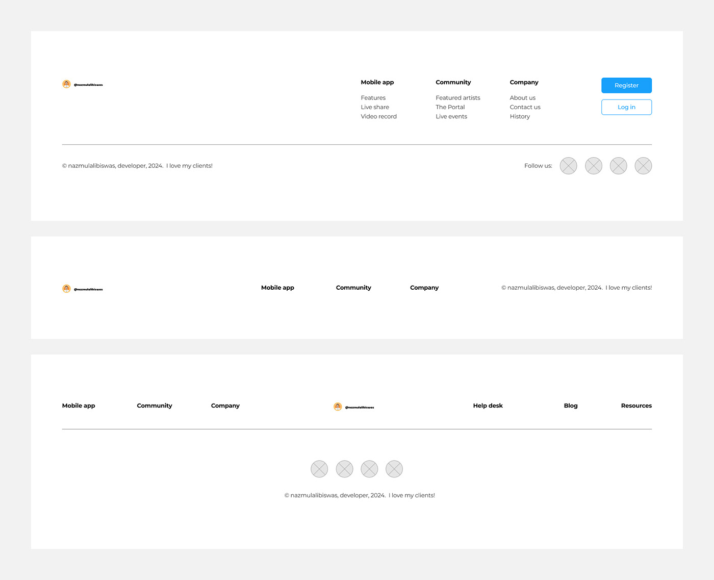
Footer
The footer is the section at the bottom of a webpage that typically contains supplementary information and navigation links. While the header serves as the top navigation area, the footer is its counterpart at the bottom, providing users with additional resources and options.
What is footer?
Here are key elements and best practices for designing an effective footer:
Navigation Links: Include important navigation links in the footer to help users find their way around the website. This can include links to key pages such as About Us, Contact Us, FAQs, Terms of Service, Privacy Policy, and Help/Support.
Contact Information: Display contact information such as the company's address, phone number, and email address in the footer. This provides users with a way to get in touch with the website owner or organization if they have questions or concerns.
Social Media Links: If applicable, include links to the website's social media profiles in the footer. This allows users to connect with the website on social platforms and stay updated on the latest news and updates.
Copyright Information: Include copyright information in the footer to indicate ownership of the website's content. This typically includes the copyright symbol (©), the name of the website or organization, and the year of publication.
Sitemap: Consider including a sitemap or site index in the footer, especially for larger websites with a lot of content. A sitemap provides users with an overview of the website's structure and helps them navigate to specific sections or pages.
Back to Top Button: If the webpage is long and requires scrolling, include a "Back to Top" button in the footer to allow users to quickly return to the top of the page without manually scrolling.
Accessibility Links: Include links to accessibility resources or tools in the footer to ensure that all users, including those with disabilities, can access and navigate the website easily.
Design Consistency: Maintain design consistency between the footer and the rest of the website to ensure a cohesive user experience. Use consistent typography, colors, and spacing to integrate the footer seamlessly into the overall design.
Responsive Design: Ensure that the footer is responsive and displays properly on all devices and screen sizes. Test the footer across different resolutions and devices to ensure that all elements are visible and accessible.
Whitespace and Organization: Use whitespace and visual hierarchy to organize the elements in the footer and make them easy to scan and navigate. Avoid clutter and overcrowding by prioritizing the most important information and keeping the design clean and uncluttered.
By incorporating these elements and best practices into the footer design, you can create a functional and user-friendly footer that enhances the overall usability and accessibility of your website.

Thanks advance for appreciations...

